Visual Perception

U. Wong and P. Ruchikachorn, The Effect of Internal Patterns on Perception Accuracy in Bar Charts, EuroVis Posters, Luxembourg, 2025.
📄 Preprint
Bar charts are widely used for comparing categorical data due to their simplicity and effectiveness, while pictographs enhance engagement and memory retention. This study aims to combine the strengths of both visualization techniques through redundant encoding, integrating internal patterns to improve perception accuracy. By testing various pattern designs, the study evaluates their impact on value estimation. Results indicate that some patterns enhance accuracy, while others increase complexity that can hinder readability. These findings contribute to optimizing bar chart design for clearer and more intuitive data interpretation.
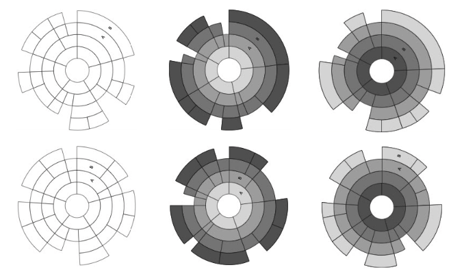
S. Songsakulkiat and P. Ruchikachorn, Familiarity vs. Correctness: Arcs and Angles in Sunburst Charts, PacificVis Posters, Tianjin, China, 2021.
🖼 Poster
📄 Preprint
A Sunburst chart visualizes hierarchical data as concentric rings. Similar to a pie chart, a Sunburst chart may be read through arc lengths or sector angles, but its multilevel nature makes arc lengths across levels unreliable as a visual variable. In this study, we designed Sunburst chart variations to test whether they affect chart reading performance. We found that the participants used arc lengths to read chart values, confirming a previous study. Other factors in the experiment suggested that the values in focus should be placed in adjacent layers and in quadrant III and IV as the participants tended to correctly read data values through angles instead.
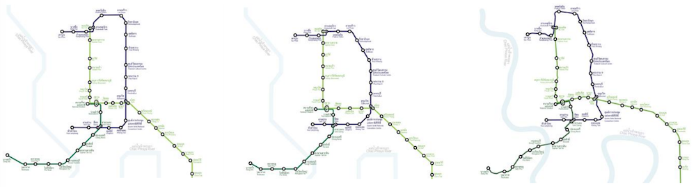
C. Kiratiwiriyaporn and P. Ruchikachorn, A Study and Design of Transit Map based on Visual Perception, PacificVis Posters, Bangkok, Thailand, 2019.
📄 Preprint
Transit maps can be designed in infinitely many different styles but not all of the designs are equally effective. To design an efficient transit map, it is important to understand route selection of passengers based on their visual perception. This paper developed six different transit maps and conducted a route selection experiment to explore the impact of using transit map as a planning tool to influence passengers’ travel decisions to find the fastest route in the Bangkok Mass Transit System (BTS) and Metropolitan Rapid Transit (MRT). The experiment with 90 participants was conducted through a paper-based survey of six travel decisions per map design. The results show that different map designs significantly affect the participants’ accuracy and time to find the fastest route.
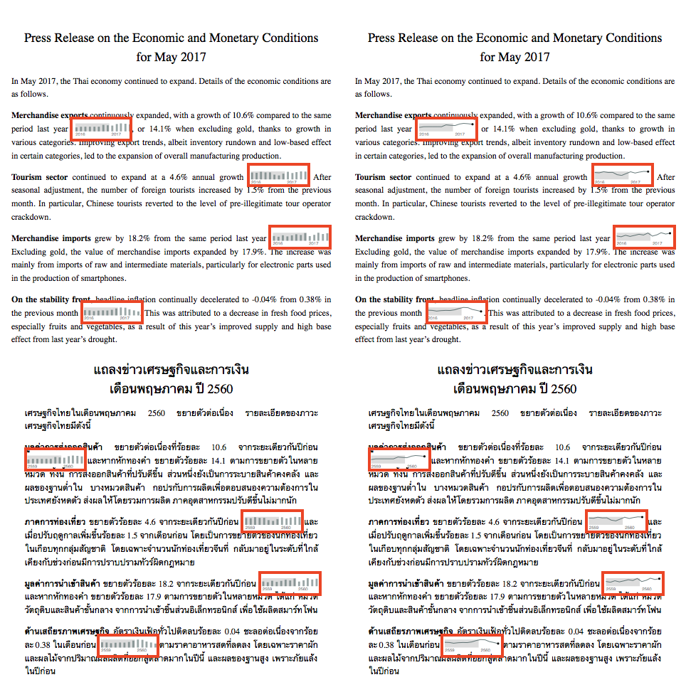
P. Ruchikachorn and P. Rattanawicha, An Eye-Tracking Study on Sparklines within Textual Context, EuroVis Posters, Brno, Czech Republic, 2018.
📊 Slides
🖼 Poster
📄 Stimuli
Sparklines are placed in documents but their usability is rarely evaluated in their immediate context of paragraphs of text. We conducted an eye-tracking study to measure readability and understandability of four different conditions: two different sparkline chart types (bar and line charts) and two text languages (native and non-native languages). We found out that most participants out of 296 in total were not distracted by sparklines. Only 3.19% of the average reading time was spent looking at sparklines. There was no correlation between dwell time and data understanding, measured in a post-experiment quiz. The chart types did not have a significant effect on sparkline attention. However, compared with native textual context, sparklines in non-native text were more noticeable. The results of this study can be useful for future sparkline usage consideration.