Visual Literacy & Storytelling
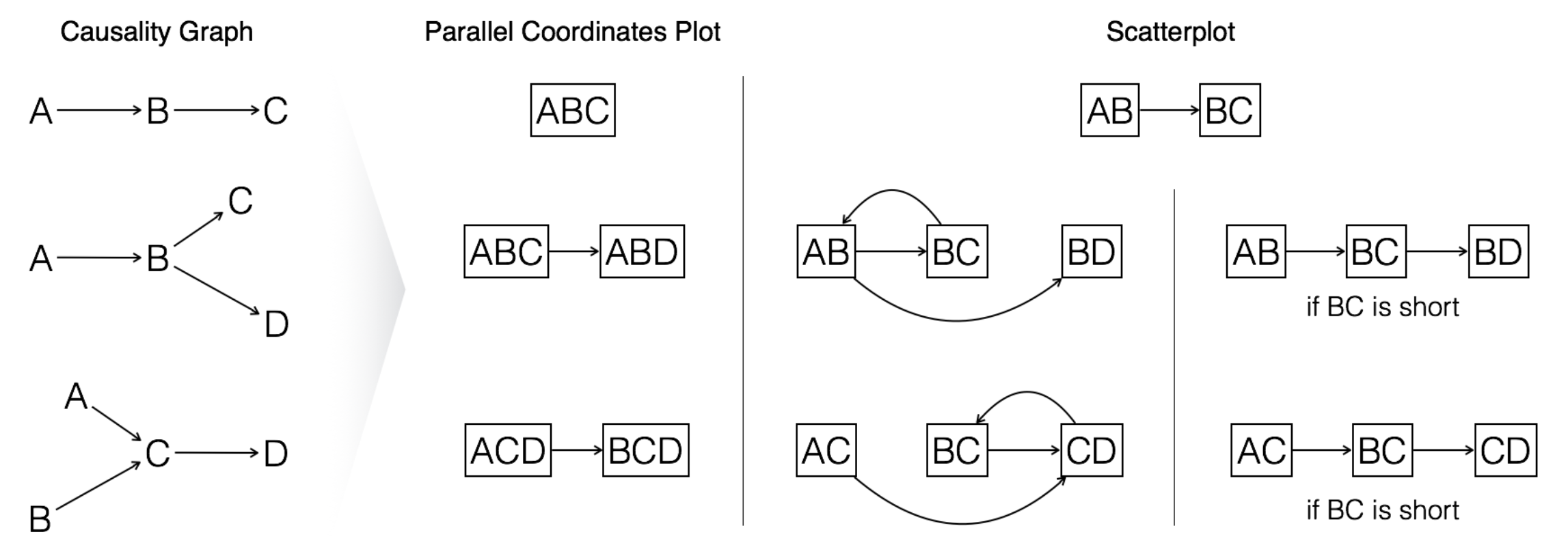
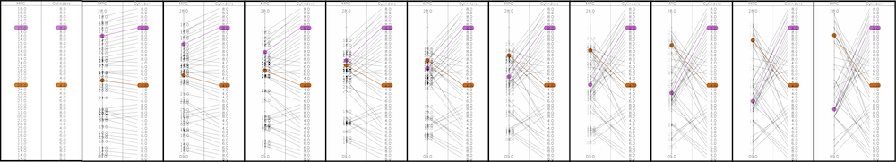
P. Ruchikachorn, D. Coelho, J. Wang, K. Striegnitz, and K. Mueller, Generating Coherent Visualization Sequences for Multivariate Data by Causal Graph Traversal, IEEE TVCG, vol. 32, no. 3, 2026.
Multivariate data contain an abundance of information and many techniques have been proposed to allow humans to navigate this information in an ordered fashion. For this work, we focus on methods that seek to convey multivariate data as a collection of bivariate scatterplots or parallel coordinates plots. Presenting multivariate data in this way requires a regime that determines in what order the bivariate scatterplots are presented or in what order the parallel coordinate axes are arranged. We refer to this order as a visualization sequence. Common techniques utilize standard statistical metrics like correlation, similarity or consistency. We expand on the family of statistical metrics by incorporating the rigidity of causal relationships. To capture these relationships, we first derive a causal graph from the data and then allow users to select from several semantic traversal schemes to derive the respective chart sequence. We tested the sequences with a crowd-sourced user study and a user interview to confirm that the causality-informed visualization sequences help viewers to better grasp the causal relationships that exist in the data, as opposed to sequences derived from correlations or randomization alone.
W. Sriswasdi, P. Banjong, and P. Ruchikachorn, Good News or Bad News First: Bias from Visualization Sequences, IEEE VIS Posters, Melbourne, Australia, 2023.
🖼 Poster
📄 Preprint
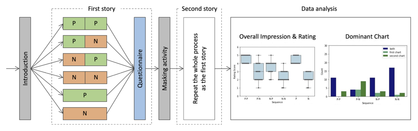
Data visualization is useful for data-driven decision making but it is sensitive to perceptual and cognitive biases, which may lead to distorted conclusions and actions. Since data presentations are commonly shown in temporally sequential order, this study aims at identifying how chart sequences affect data perception and interpretation. We conducted an online survey with two stories in chart sequences which had two charts of either positive or negative polarity. The interplay of chart sequences and their accompanying stories seemed to have an impact on data perception. Certain conditions led to statistically significant perceptual differences. This study can be extended for future research aimed at developing guidelines for effective business presentations or data storytelling.
A. Duangphummet and P. Ruchikachorn, Visual Data Story Protocol: Internal Communications from Domain Expertise to Narrative Visualization Implementation, IVAPP 2021.
🕹 Data story 1: https://ippd.or.th/thailand-productivity-story/ (in Thai)
🕹 Data story 2: https://ippd.or.th/plasticstory/ (in Thai)
🕹 Data story 3: https://ippd.or.th/pm2-5/ (in Thai)
🕹 Data story 4: https://ippd.or.th/roadsafety/ (in Thai)
📄 SciTePress or Preprint
Data stories play an important role in effectively and intuitively communicating data insights as well as enabling the audience to understand important social issues. Crafting a data story needs several sets of skills, we propose a five-phase data story protocol in order to guide data story design and development, and promote interdisciplinary team collaboration. This protocol was developed from our working team reflection on four data story projects and researching the related work. We hope that this protocol could be one potential way for non-journalism organizations to conduct data stories for their target audience.
P. Ruchikachorn, P. Duangklad, and T. Ruangdej, A Case Study of Data Visualization and Storytelling Workshop for Middle School Students, PacificVis Posters, Tianjin, China, 2020. [Honorable Mention Award]
🖼 Poster
📄 Preprint
Visualization and storytelling skills can be trained during early school years. We aimed to teach visualization knowledge through a workshop whose participants were 100 middle school students across Thailand. With several tangible materials and an assigned topic, a group of five students collected data, mostly from a primary source, produced a visualization and gave a short presentation on data insights. Despite different backgrounds, all groups shared similar visualization types. Concrete and abstract data representations in pictographs, bar charts, and pie charts were popular.
P. Ruchikachorn and K. Mueller, Learning Visualizations by Analogy: Promoting Visual Literacy through Visualization Morphing, IEEE TVCG, vol. 21, no. 9, 2015.
🕹 Demo: The interactive versions of the morphings of all visualization pairs are at http://puripant.github.io/vis-analogy/
📊 Slides
We propose the concept of teaching (and learning) unfamiliar visualizations by analogy, that is, demonstrating an unfamiliar visualization method by linking it to another more familiar one, where the in-betweens are designed to bridge the gap of these two visualizations and explain the difference in a gradual manner. As opposed to a textual description, our morphing explains an unfamiliar visualization through purely visual means. We demonstrate our idea by ways of four visualization pair examples: data table and parallel coordinates, scatterplot matrix and hyperbox, linear chart and spiral chart, and hierarchical pie chart and treemap. The analogy is commutative i.e. any member of the pair can be the unfamiliar visualization. A series of studies showed that this new paradigm can be an effective teaching tool. The participants could understand the unfamiliar visualization methods in all of the four pairs either fully or at least significantly better after they observed or interacted with the transitions from the familiar counterpart. The four examples suggest how helpful visualization pairings be identified and they will hopefully inspire other visualization morphings and associated transition strategies to be identified.