Applications & Dashboards
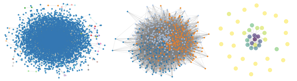
I. Sukcharoenchaikul and P. Ruchikachorn, Visual Methods for Network Analytics of Echo Chamber: A Case Study of Thailand’s General Election 2023, DATA, Bilbao, Spain, 2025.
📄 Preprint
This research develops visual methods to study the echo chamber effect through a case study on Thai-land’s 2023 General Election. Using visualization techniques like node-link diagrams, t-SNE projections, and heatmaps, it examines homophilic relationships, clustering, and polarization in online communities. To minimize inaccuracies and biases, network graphs are created from contextual analysis of user-generated content, rather than relying on predefined relationships like friendships or followers. The study applies the Echo Chamber Score (ECS) with visualizations to explore variations in analytical methods and how they capture different aspects of echo chambers. Additionally, it illustrates how political events shape online discourse and community dynamics by linking ECS with key political milestones.

T. Amattayakul and P. Ruchikachorn, Effect of Data Visualization on Users’ Running Performance on Treadmill, DATA, Bilbao, Spain, 2025.
📄 Preprint
This paper examined how real-time data visualization influences treadmill users’ performance and experience. Traditional treadmill displays are often represented with texts, limiting user engagement and motivation. By applying visualization techniques that align with human cognitive processing, such as line charts and progress indicators, we proposed data visualization designs to represent running performance metrics more meaningfully. The study applied 3 display conditions: traditional and two improved visualization displays. Through a within-subjects experiment with 18 participants, metrics such as time to exhaustion, heart rate, distance, and calorie expended were collected along with subjective feedback. Statistical analysis showed that both visualization displays significantly improved running performance and satisfaction. Results showed that real-time feedback with data visualization design can positively influence users’ understanding and psychological connection to their fitness data. These findings highlight the potential of data visualization to perceive and elevate user experience in exercise interfaces.
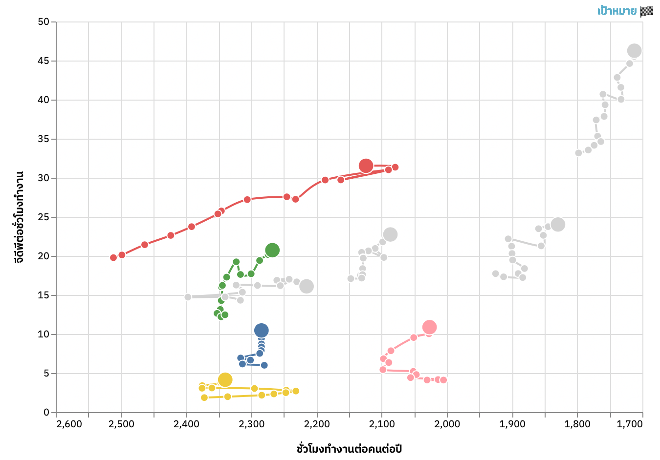
P. Ruchikachorn, Applying Uncommon Visualizations to Government Dashboards, IVAPP 2021. [Best Poster Award]
🕹 Connected scatterplot: http://www.ippd.or.th/where-thailand-is/ (in Thai)
🕹 Hex Map: http://puripant.github.io/thailand-hex-map/ (to create the hex map of Thailand)
🖼 Poster
📄 SciTePress or Preprint
Many governments provide data dashboards to present the state of the countries or administrative activities. Their main target audience is typically the citizens but the dashboard design process is usually top-down and leads to formulaic results. Developing three data dashboard projects for the government of Thailand, we successfully applied two uncommon data visualizations, grid map and connected scatterplot, despite initial resistance from the government agencies. We documented the design process including feedback on the two visualizations and solutions to alleviate their concerns. Academic studies had little success in convincing stakeholders. In both visualizations, animations helped to frame the concept of the uncommon visualizations.
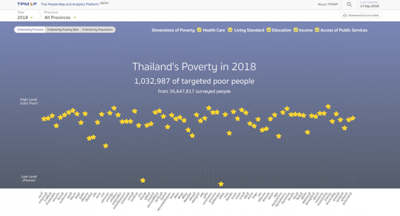
N. Surasvadi, P. Ruchikachorn, C. Siripanpornchana, S. Thajchayapong, and A. Plangprasopchok, TPMAP: a Data Analytics and Visualization Platform to Support Thailand Target Poverty Alleviation Programs, PacificVis Posters, Bangkok, Thailand, 2019.
🕹 Demo: https://www.tpmap.in.th (in Thai)
🕹 Star: https://github.com/puripant/svg-stars (code snippet to create SVG stars)
🕹 Hex Map: http://puripant.github.io/thailand-hex-map/ (to create the hex map of Thailand)
📄 Preprint
This paper presents Thai People Map and Analytics Platform (TPMAP: https://www.tpmap.in.th), a data analytics and visualization platform to support target poverty alleviation programs in Thailand. TPMAP aims at enabling Thailand policy-makers to identify the poor, locate them, and understand their basic needs. We use a star as a multidimensional data glyph throughout various charts navigated through a geographical hierarchy. The online platform is being used by a few local government officials to tackle the poverty problem.
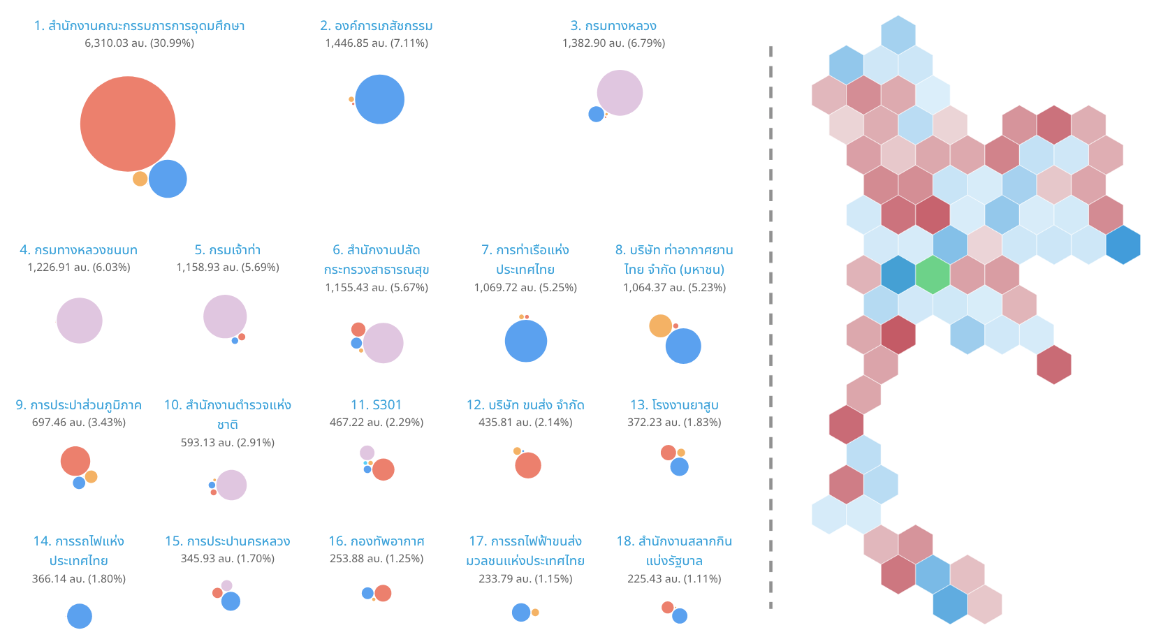
P. Ruchikachorn, R. Suveeranont, and T. Luangaroonlerd, A Case Study of Open Data Visualization System for Government Transparency in Thailand, PacificVis Posters, Bangkok, Thailand, 2019.
🖼 Poster
📄 Preprint
Open data is essential to government transparency. However, simply opening access to the government data files does not guarantee data accessibility to the general population. An efficient way is to digest the data and visually present its insights. We designed and implemented a visualization system to communicate the data stories of Thai government procurement to both the public and journalists. Our iterative design process consulted two political reporters. The final design incorporated a scroll-based storytelling and several visualization elements which had not been available such as a hexagonal grid map of Thailand. We demonstrated the usefulness of this system with a scenario regarding government budget transparency.
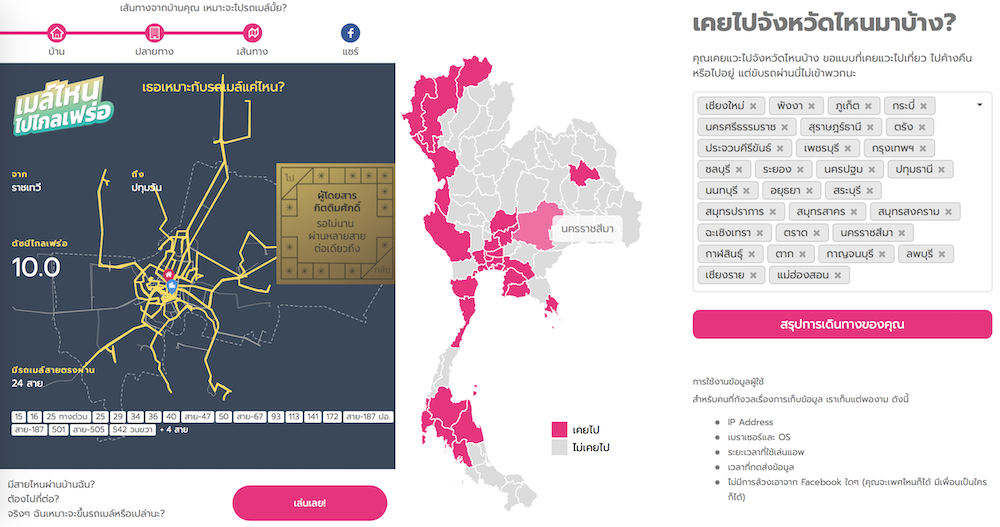
P. Ruchikachorn, Case Studies of Shareable Personal Map Visualization, EuroVis Posters, Brno, Czech Republic, 2018.
🕹 Demo: Where Have I Been to? (Thailand version)
📊 Slides
🖼 Poster
This paper presents two examples of personal data visualizations to be shared among peers. The visualized and shared data were travel destinations in Thailand and daily commutes in Bangkok, Thailand. The former gathered much attention with almost a million visitors within the first week after launch or approximately 2% of internet users in Thailand. Despite minimal data collection, large data samples of the first case study enable various analyses. The easy-to-use interfaces and simple visualizations can be a model of the genre of personal visualization whose main task is to share.
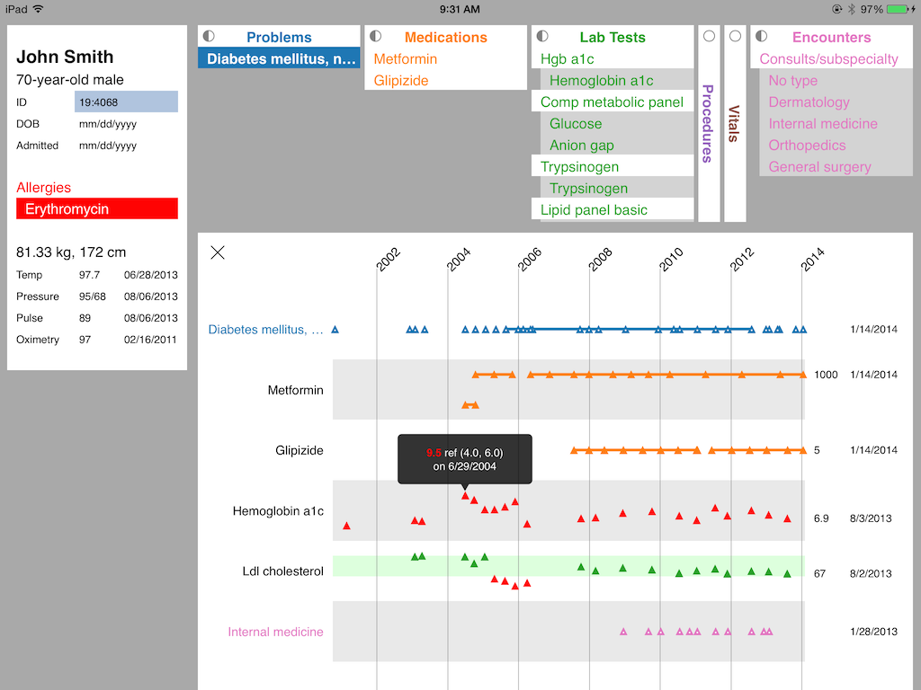
P. Ruchikachorn, J. J. Liang, M. Devarakonda, and K. Mueller, Watson-Aided Non-Linear Problem-Oriented Clinical Visit Preparation on Tablet Computer, Visualizing Electronic Health Record Data (EHRVis), IEEE VIS Workshop, Paris, France, 2014.
📊 Slides
🖼 Poster
📄 Preprint
Tablet computers have been growing in popularity and finding their way to workspace. Their ubiquity is attributable to their ease of use and portability, also applicable to hospital work environment. We have designed an Electronic Medical Record (EMR) application for clinical visit preparation task on tablet computers. There are many design challenges due to the limited form factor for both input and output. According to our interviews with physicians, our solution utilizes IBM Watson’s machine learning ability to analyze unstructured clinical notes and create a relation graph of medical entities. With the medical knowledge graph, the system enables easy relation retrieval to show only relevant information as needed in simple and easy-to-understand displays. We informally evaluated our system by walking through sample visit preparation steps from a physician.